Posts

Course wrap-up

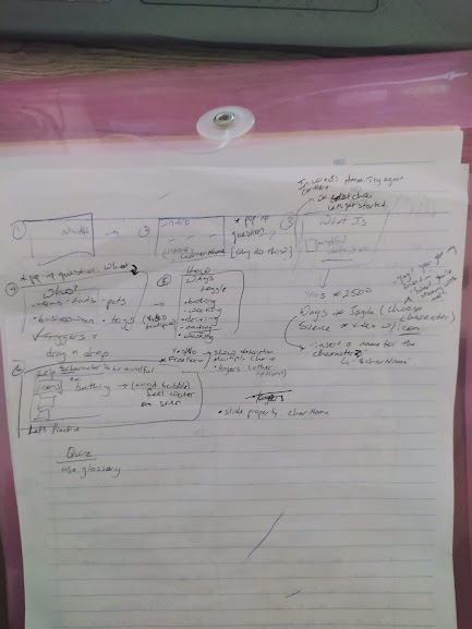
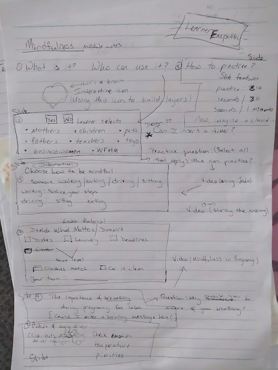
Well, this is it. And what a ride! What did I learn about being an instructional designer?  First, is the role of creativity. In the creative problem-solving process, of the three stages -- problem preparation, idea generation, and idea evaluation -- the most difficult will present itself in the idea generation stage (Herring et al, 2009). No wonder here. Generating creativity calls to mind a blank slate that must be filled, which produces all sorts of anxiety for me because I don't feel like I'm all that creative.  That's why "sketching" my design project was so helpful for me. I took to drawing out as much detail as I could -- slides, pop-up questions, and ideas for interactivity. The "thinking sketch" (van der Lugt, 2005) helped me see my ideas in the big story and places for improvement. I didn't, unfortunately, stick to the design I'd put on paper. Once I started building, I'd get a new idea or see a neat interactivity function that I

The importance of feedback

I'm going through design feedback. I'm grateful for this part of the process actually. It's helpful for me to see what the "learner" would be doing, despite my design idea. Watching the instructor get "frustrated" and "confused" with items that I included text for but he didn't read was good for me to see. It's true, then. You can have the directions right there in front of someone, but I knew they were instructions because I put them there. Now, is it that I should make it simpler or expect learners not to read a slide before they go clicking around. Or, perhaps by that point there were already so many "issues" with the course that the learner expected what's going wrong to be because of design and not user experience. UX is vital to design planning. I can think all day in my mind what I want to do and the ways things should be done. But If the learner doesn't make that connection, I have to go back to my design. Inst

Design Phase: Interactivity

Image
Thinking about creativity. Where can I draw inspiration? What have I learned as an ID with this module? For one, how can I introduce a topic in a way that feels fun and interactive, but still meaningful? Answer: Think about video games.  "The focus of learning is on completing challenging tasks that are typically complex and change over time." (Dickey 2005) The focus of my module is developing mindfulness. Then, in the beginning of the course I just want to get the learner's feet wet with the course. Maybe test their comfortability with interactions, something simple like asking the user to insert her name on the introductory slide. learner enters name, will display name again later How the strategy behind video games compliments work for instructional designers (Dickey 2005). Video games are primarily for entertainment, but many of their functions can be useful in an educational arena as well.  Dickey also mentions how emerging media keeps IDs on their toes, as it were.

PowerPoint Corruption

The Cognitive Style of Power Point: Pitching Out Corrupts Within   Oh, Powerpoint. Death by Powerpoint is a real issue. The best way to bore your audience is that tried-and-tired presentation by means of reading a collection of slides with simple graphics. As Tufte (2006) mentions, its been the standard among corporate and government businesses that includes bulleted lists and lacks overall quality. The article goes into discussing how analytical data is trunked out on a PP through what he calls slideware. What's interesting is how he actually analyzes the structure of the slides. The author goes through the typical slideware protocol and addresses certain nuances about why this is a poor format. For instance, the "exposing the first line... then the second line... and the final line" was a great visual. Everyone has been there. The issue, then, is that these Powerpoint presentations are not statistically relevant to their audience or in driving information. In fact, the

Design Updates

Image
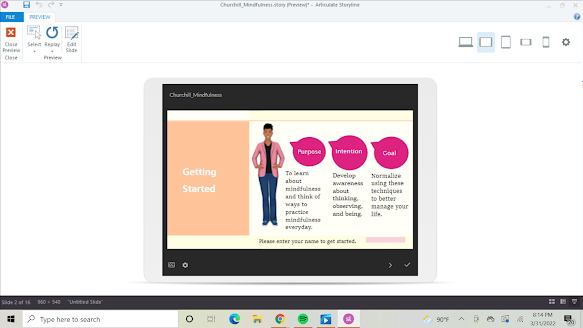
Mar 7: Learn about variables adding a name  using a name %name% = project variable Formatting!!! 😭 Design question: How to: - remove the menu from the player view - confirm the menu isn't showing in the player view - remove the auto-advancing features. I think I've built in animations somewhere but I can't figure it out ID Reflection: I'm spending hours  on what seems to be small, trivial details. That's the most frustrating part. Like, for instance, sticking pictures into a box so that they're all cohesive and pleasant to the eye. * best practices:: change name of triggers/layers/features in case you want to refer back to them later ID trick: Use the "notes" section in the slide to jot notes about ideas for slide ---- Who Can Practice slide (notes) this slide will feature drag-and-drop.  the user will add the icons on the left to the right. if they’re incorrect, a “”No,__user name, that’s incorrect” can appear and bounce back into place can “Everyone

Layout of Module

Image
  module layout

Storytelling

Image
How does developing learner empathy help me design an optimal learner experience?  Parrish (2006) calls it a necessary skill for IDs, a "dramatic rehearsal". The design story calls for a character, who the ID follows along their instructional journey. In first-person viewpoint, describe the experience of the learner including their atmosphere, thoughts, external factors.  Quick record (don't spend much time on details) Present tense Inhabit the learner Use empathetic imagination Design perspective: Who is my learner? A working mother who wants to manage her stress better. What's her story? Inhabit the learner. When does she take the course? Why? With what expectation? What are her surroundings when taking the course? Describe her disposition. When does it benefit me most in this project to create the design story? Answer: During the Design phase (Parrish 2006) Learner: Pam. She's a work-from-home mother to her two-year-old daughter while also managing an online bu